
Use the billboard effect for better ads
John Foust
Mar 1, 2026


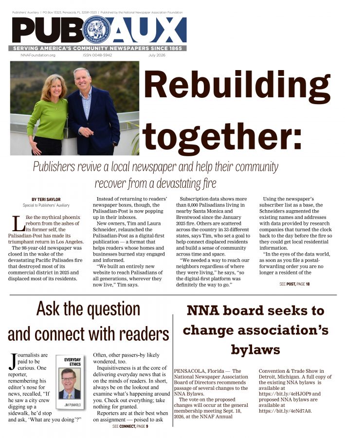
A quick study of billboards can give us a better understanding of what works best in advertising. Because motorists are on the move, billboards have just a few seconds to be seen and read. It’s the same with printed pages and digital screens; readers have only a moment to notice an ad as they pass. That’s why the best messages have a “billboard effect.” They stand out at a glance.
One of the best billboards I’ve seen was on Interstate 95 in South Carolina. Beside the bridge over Lake Marion, there was a large sign featuring an illustration of a striped bass that stretched nearly from border-to-border — big as a whale. The picture appeared against a clean background, with the headline, “Not quite actual size.” The Santee Cooper logo was at the bottom.
Santee Cooper is the state-owned electric and water utility that provides hydroelectric power from the Santee and Cooper rivers. The company created Lake Marion and Lake Moultrie, which are well-known for fishing and outdoor recreation. Their sign beside I-95 was nearly impossible to miss.
Compare that sign to another one I remember. It was so bad that I stopped to count the words — 48 in all, along with two logos, one website listing, two sets of directions and no illustration. The billboard was promoting a restaurant, although the only people who knew it was a restaurant were probably the restaurant owners and the folks who put up the sign.
Two billboards — opposite impact. How would those same ads look on a newspaper page or website? Likely the same as on the roadside. One would work, and one wouldn’t. The striped bass would leap off the page and the screen, and the restaurant ad would fade into the background.
LET’S TAKE A LOOK AT WHAT GOES INTO THE BILLBOARD EFFECT
1. Large graphic hook. Every ad — large or small — can benefit from a graphic hook. Like the fish that took up most of the space, any advertiser can feature a large single graphic in their ads. There’s nothing wrong with having several pictures in an ad; just make sure one is considerably larger than the others.
If there’s no illustration, turn the headline into a graphic hook — with large, bold typography.
2. Clean background. White space will never go out of style. In addition to making the information on that white space more noticeable and readable, it provides breathing room between the ad elements and the border.
Many powerful ads have more white space than “ink” space. White space is like a beacon that says, “Hey, this is important.”
3. Simple headline. While billboard copy should be limited to a short, bold headline, most print and digital ads have accompanying body copy. In either case, the headline should be easy to read at a glance.
Turning the pages of a newspaper is like driving on the highway. Ads go by so quickly that it’s a challenge to grab attention before readers have moved on. © Copyright 2026 by John Foust. All rights reserved.
John Foust has conducted training programs for thousands of newspaper advertising professionals. Many ad departments are using his training DVDs to save time and get quick results from in-house training. Email for information: john@johnfoust.com